
Choosing the Right Paper for Your Giclée Prints
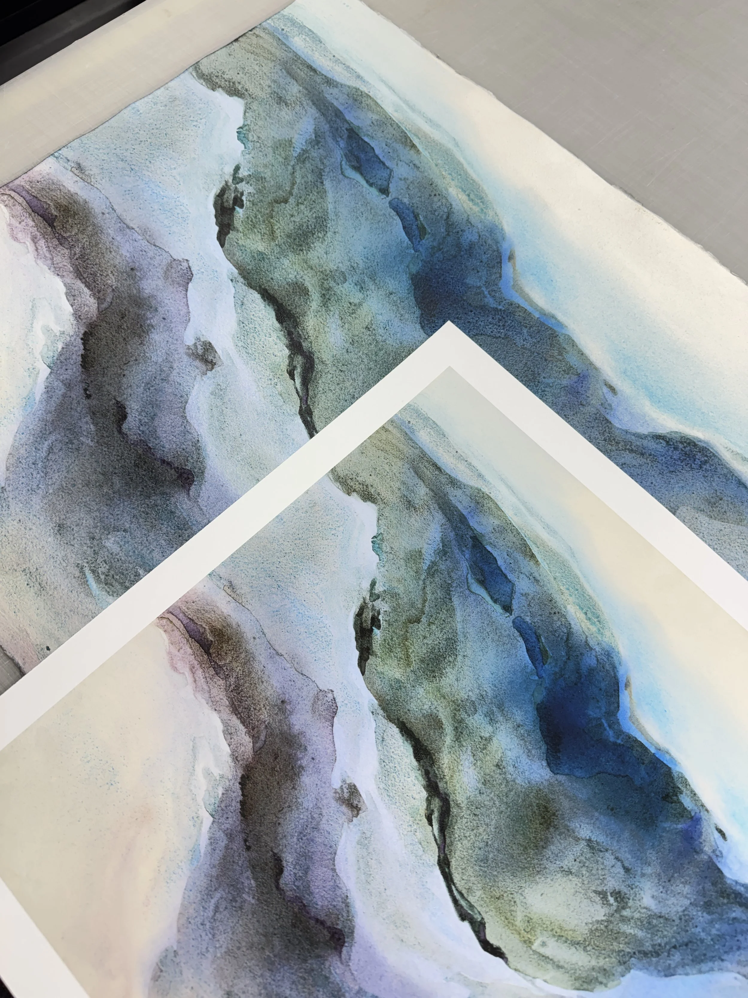
A side-by-side of a giclee print on Epson Hot Press and an original watercolour by Toronto artist, Rayne Tunley.
The paper is half the print
When artists and photographers order giclée prints, the most common paper request is for a 100% cotton, acid-free, lignin-free, matte paper. These qualities are widely recommended for good reason, and they're a solid starting point. But fine art papers and canvases come in a much wider range of materials, coatings, textures and finishes, and the right one can make a noticeable difference in how your print looks.
The paper decides how deep your blacks go, how vivid your colours can get, whether the print has texture or sheen, and how it should be framed. Choosing it well is one of the simplest ways to make a reproduction feel true to the original.
In this post we'll walk through what changes from one fine art paper to another, the main types of paper and canvas, and a recent project where switching papers made all the difference.
What changes from one paper to another
Every fine art paper and canvas has its own character. Five qualities matter most when choosing one for your work.
Colour range (gamut): Some papers can reproduce a wider range of colours than others. Coated papers with a smooth, slightly reflective surface hold ink on top and keep colours vivid. Matte papers scatter more light, so very saturated colours can look softer.
Black depth (D-max): How dark the darkest black can go affects contrast and the sense of depth. Glossier and baryta papers reach deeper blacks than matte papers.
Texture: Smooth papers show fine detail cleanly. Textured papers and canvas add a tactile quality that can echo brushwork or a paper original.
Sheen: Matte papers have no glare and feel quiet and painterly. Satin and gloss papers add punch but reflect light, which affects where the piece can hang.
Presentation and longevity: Paper prints are usually framed behind glazing. Canvas can be stretched and hung without glass. All the archival papers and canvases we use are designed for long-term display with pigment inks.
The main types of fine art paper and canvas
| Medium | Look and feel | Often a good fit for |
|---|---|---|
| Smooth matte paper (e.g. Epson Hot Press) | Flat, velvety, no glare, fine detail | Watercolour, drawings, illustration, soft-toned work |
| Textured matte paper (e.g. Cold Press, cotton rag) | Visible paper tooth, painterly | Watercolour, gouache, pastel, mixed media |
| Baryta and satin photo papers | Subtle sheen, deep blacks, vivid colour | Photography, saturated paintings, high-contrast work |
| Canvas (poly/cotton blends) | Woven texture, can be stretched and hung without glass | Acrylic and oil paintings, large-format pieces |
A real example: when a watercolour needed a different paper
Rayne Tunley is a watercolour painter whose prints we've produced for several years. For most of her work, we print on Epson Hot Press. It's a smooth, matte fine art paper, and it suits watercolour beautifully. The surface has the same quiet, glare-free feel as her original paper, and soft washes and fine edges come through cleanly.
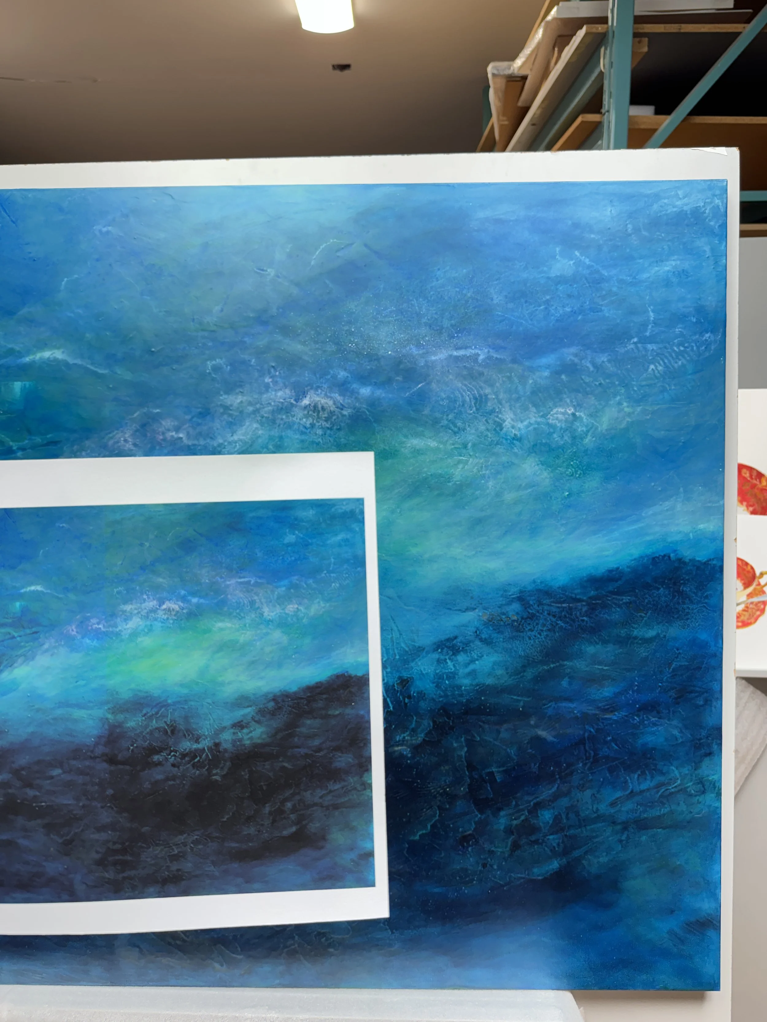
Original (back) with a test print on Epson Hot Press (front)
Every so often, though, a painting doesn't fit that pattern. Some of her pieces use intense, saturated pigments like deep, rich blues (pictured above) or highly saturated reds. On a matte paper, those colours sit near the edge of what the paper can reproduce when also trying to balance contrast and details with the rest of the piece. During proofing, we saw some areas shift noticeably in colour, leaning toward purple, because the matte paper's gamut couldn't hold those blues.
For these pieces, we switch to Hahnemühle FineArt Baryta. Its smooth, coated, satin-gloss surface holds more colour and reaches deeper darks. The result is a print where the deep, saturated blues reproduce accurately, without losing the softer passages around them.
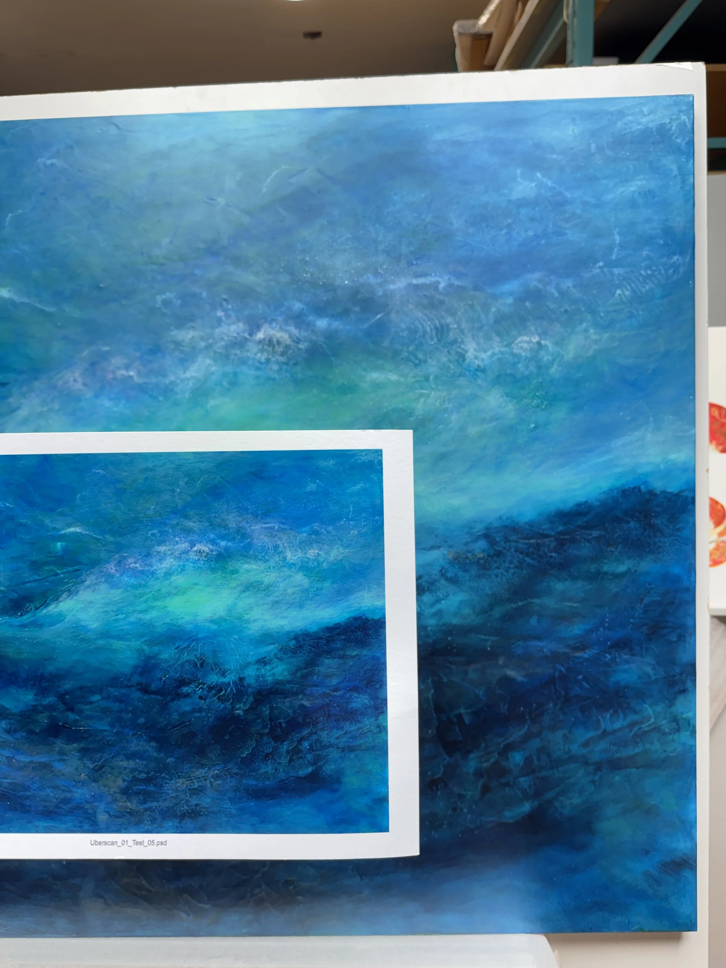
Original (back) with a test print on Hahnemühle FineArt Baryta (front)
The takeaway isn't that baryta is better than Hot Press. For most of her paintings, Hot Press remains the right choice. The point is that the paper should follow the artwork. A paper that's perfect for one piece can hold back another, even from the same artist.
How to choose the right paper for your work
A few questions will narrow it down quickly.
What was the original made on? Matching the feel of the original surface, such as watercolour paper or canvas, often makes a reproduction more convincing.
How saturated are the colours? Bold, intense colours and deep shadows usually benefit from baryta or satin papers. Soft, muted palettes often look best on matte.
How much does texture matter? Choose smooth paper for crisp detail, and textured paper or canvas when you want the print to feel tactile.
Where will it hang? Glossier papers can reflect light in bright rooms. Matte papers and canvas are more forgiving.
How will it be framed? Paper prints are typically framed under glazing. Canvas can be stretched and hung as is.
If you're unsure, a test print on two papers side by side will tell you more than any spec sheet.
Not sure which paper is right? Ask us
Choosing the right paper is part of every print job at Colourgenics Fine Art Imaging. We look at each piece during file prep and proofing and recommend the paper or canvas that will represent it best. Sometimes that confirms your usual choice, and sometimes it points to something new.
If you're preparing a new edition or want to see how your work looks on different papers, get in touch to book a free consultation. We can talk through through options and identify some papers you can proof your images on to help make a final decision.
Related reading: Inkjet, Giclee & Fine Art Printing: Which Is Right For You? and A Guide to Image Resolution.